For my first card I printed the image in it's original size.....then cut 2 tag shapes from it to create a layered focal image.....
I couldn't ask for a better match for the flowers in the image than Mulberry Cottage Rose Flowers (available again soon) and the Chevron Stripe on Twill on Pink ribbon.
I generally don't put a sentiment on the outside of my cards as I like for them to be more all occasion...but this little Birthday image stamped on a basic banner shape was just the perfect neutral addition to break up the busy patterns.
I am a big fan of spacers between layers to add extra depth. I've also really distressed the edges.The finishing touch for this card was altered chipboard feathers with glitter and micro beads and some cheesecloth with inking to coordinate.
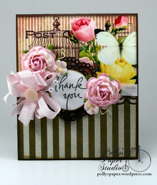
For the next card I printed the image large enough to be substituted for regular patterned paper. Partnered with a coordinating stripe it covers the entire front of the card.
Once again I was able to pull the ribbon and flowers from my Really Reasonable Ribbon supplies to coordinate perfectly with the printed image. Pink Wrinkle Ribbon, Trellis Roses, and Sweetheart Blossoms. I always love brown and pink together....such a classic combination.
This card is finished inside with coordinating patterned paper.I've added the sentiment to the front again....it's just kinda crazy day!!!
This small arrangement is very offset to work around the printed image...but it still balances very well because of the busy pattern. To finish my bow I added a real vintage button and 2 pearly headed stick pins.
On to the 3rd card......I printed the image just a bit smaller and used it as a focal image layered on a diecut frame. Landscape orientation is another thing I do not do too often....but hey I'm walking on the wild side today!
I love these simple poofy bows finished off a matching button tied with string.
As you can see the distress tool got a lot of use for these projects. It adds so much texture especially when adding chipboard spacers to the layers. There are a few light gray pearly accents to finish the corners and coordinating paper inside.
Okay....last but not least is my take on CAS...which I will be the first to admit...I do struggle with. My eyeball was twitching not being able to add lots of layers. But I am pleased with the outcome...and it was super fast to put together....you could make elebenty hundred of them in no time flat..so I can see this style of crafting appealing to someone who needs a lot of cards fast..like thank yous or invitations. Also this is an A2 sized card so I printed the image a bit smaller.
A simple not so poofy bow with a few flowers was really just right for this size card. This Topaz Blue Ribbon with Grosgrain Edge is super yummy!!!! More pretty matching flowers to top off the bow. I added the sentiment just by simply stamping it right onto the corner of the printed image.
Okay...I'm not saying I want to do it again any time soon....but the CAS card did not actually kill me....so I'm not counting them out totally.
Here is the Times Remembered Digital Collage Sheet from my shop. I'm very pleased with the variety of projects I was able to create with just 1 sheet.
Well now that I've written the longest post ever and my poor fingers are cramping up I'll be off. Wishing you all a happy and productive day with lots of time to be creative :) G


Ginny - gorgeous cards and beautiful bows and flowers. Nancy Hill
ReplyDeleteOMGosh, Ginny your cards are simply stunning. I love every single one. The ribbons look great and matched with papers you used beautifully.
ReplyDelete